Santa Teresita Before & Afters – Part I
- Jun 17, 2020
- 5 min read
Updated: Jul 20, 2020

I am so excited to share the before and afters of one of Madison Nicole Design’s very first projects, Santa Teresita! If you’ve been following over on IG, you’ve seen a few sneak peaks of this beauty – but I’m sharing some more details and giving you a look into the design process and what the house was like before we were brought in!

The exterior of this Santa Barbara home was already quite stunning on its own! It had that French Country, Storybook feel to it that just exudes charm. The character of the exterior felt a lot more welcoming than the interior, and although the owners are doing a few landscaping changes and updating it a little, for the most part, the house itself has stayed the same.
The interior though, that’s exactly where we come in! Was it the worst place we had ever seen? Far from it! But it definitely had its own weird quirks that we wanted to work out to create a more cohesive feel overall.
Before:


When you first enter through the arched wood door, you step into a double height space with French Limestone floors, a grandiose crystal chandelier, and a ornate, curved staircase. You could immediately tell that the previous owners had a more formal aesthetic, so one of our main goals was to tone everything down and make it feel more relaxed, while still matching the architectural style of the home.
All of the walls were very yellow, and had a faux finish applied that probably cost a pretty penny! We wanted to brighten them up but still keep some warmth in the space, so we gave everything a fresh coat of Farrow & Ball White Tie.

There were other areas in the house that we wanted to focus the budget on more, so we decided to leave the stairs and lighting as is. The cane chair with natural linen cushion helps balance out the formality of the entry. Add a beautiful vintage textile pillow from one of my favorite pillow ladies (hello Shoppe Marine & Co), a few accessories, and you are good to go!

Now on to the kitchen…
This kitchen was definitely very French Country feeling, but was putting out more grandma’s cottage vibes than we were wanting. Between the carved grapevine trim and corbels on the hood, and the ornate iron pot rack with more grapevines, it was just too fussy and overdone. Not to mention the yellow walls!
Before Images:


The cabinets and countertops were in pretty good shape though… nothing a new coat of paint couldn’t fix, so we decided to leave those and focus on the hood.

We gave it a more modern shape, and a more casual feeling overall with the new decorative tiles and wood trim around the hood. New brass plumbing, bronze hardware, and a brass + bronze lantern tied it all together.

The updated lighting in lieu of the pot rack allowed so much more light to shine throughout the space. Goodbye grapevines!

We ended up doing a new marble-like quartz countertop on the island, and painted the cabinets black. The island gave a lot of contrast to the perimeter cabinets, which were the opposite — black marble and white cabinets.

The existing peninsula allowed for just a couple counter stools, but these ones worked out perfectly!
The existing LaCanche range works so perfectly in the space. By simplifying some of the design elements, it allows the beautiful range to stand out like it should, instead of getting lost in all the intricate details that were mucking up the space before.

Did we mention how much we love the new brass plumbing? Brass is such a classic and timeless finish, and when paired with a beautiful style, will only get better with age.

The tile helps establish this as the much needed focal point of the space. Isn’t this a gorgeous shot? Thank you to my lovely photographer, Lindsey Drewes!


Family Room

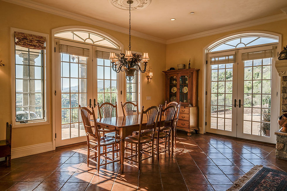
Right off the kitchen is a large family room space with multiple sets of French doors that lead out to the backyard. There are amazing views of Santa Barbara from this hilltop home, and the doors and windows let in so much natural light. But despite all that light, the space originally felt really dark and dated.
Before:

This room works perfectly as a breakfast room, since it’s so close to the Kitchen. It’s the perfect spot to sit and enjoy that morning coffee with a view. We continued on our quest to brighten and simplify this home as much as possible.

The Swedish reproduction secretaire is one of my favorite pieces that we purchased. It doubles as a workspace and mail station, helps ground that side of the room, and is the perfect solution for closed storage to hide those bills. Plus, it’s got the most stunning finish + details.


On the other side of this space is the Family Room. This is truly where everyone in the family gathers and spends the most time together, so maximizing the seating around the fireplace and TV was of utmost importance.
Before:

The previous owner had the TV to the side of the fireplace, but it felt like they were competing. After several different space planning studies, we decided it would be best to relocate the TV to the middle of the built-in.
Before:


We kept the existing terra cotta floors, as they provided a lot of warmth and great character. We installed a beautiful rug (with a great pad below to provide softness) under the two custom sofas. The walls were lightened to the same White Tie color as the rest of the house.

Did that carved grapevine mantel look familiar? Yep, same thing that was above the range in the Kitchen. Don’t get me wrong, we love our wine, and so does this client, but we didn’t need such a literal tribute to it in the room!

We were quick to replace the existing mantel with a slimmer, more casual wood beam that matched the ones we added to the hood in the kitchen. We always try to place similar elements in different rooms of a home, as it helps tie everything together and give a more cohesive look.

The family room also had a full wall of bookshelves on each side of the TV. It’s amazing how much warmth you can add to a room by styling the shelves.
We always love when clients have collected fun pieces on their travels, or have items that have meaning to them. We definitely had a mix of vintage pieces, collections from travels, and new accessories but they all work together so well to finish off this family room.
The mix of warm and cool tones in this space really turned out well. We decided to bring in the leather recliner to help balance out the gray linen sofas, and tie in the terra cotta floors.

The artwork behind the leather chair was actually an existing piece that the client had. We really liked the piece, so I put on my artist hat and added in some more blue tones to help it feel more at home in the space.

I had a ton of anxiety trying to customize this, but I think it turned out well!
The textured wood panels add so much character.

Stay tuned for the next Santa Teresita reveal posts… you won’t want to miss the dining room, living rooms, bedrooms, or the awesome playroom!
Check out another one of my projects, our Oxnard Renovation, to find more interior design inspiration. HERE.
Are you located in the Santa Barbara area? Do you need an update to your home? We would love to help! Contact Madison Nicole Design for all of your Santa Barbara interior design needs My Services


.png)
Comments