Vista Del Campo Reveal Part 02
- Aug 22, 2023
- 3 min read

This week, we're continuing our reveal of this large, colorful home for these clients and their five kids, taking a peek into the family room and the dining room! If you missed last week's post featuring the entry, living room, pantry, and kitchen, take a minute and check that out first to see how these spaces complement the adjacent areas as well.

This is the wall directly behind the kitchen range wall, and we just didn't see the need for the wall cutout (both visually and functionally as a dust collecting mechanism), as well as the built-in architectural details. Simplifying architecture was a big theme of this project - you'll see this to be true if you had a look at last week's post!

Ahhhh, so much better! We closed up that wall, added rift sawn oak shelving so we wouldn't run into problems with a built-in cabinet next to the soffit above the window, and designed a full wall of lower closed storage for kids toys and games. The Benjamin Moore Revere Pewter color of the cabinets gives us just enough contrast and warmth next to the white walls.

This room is where the family would be hanging out together the most often, so a big sectional was a priority in this space. And I still can't get over the views and plant life right outside their windows - it looks like a resort out there! With so much green coming through the window, we went a bit more neutral with the furniture upholstery, and added some complimentary green pillows from our MND line to keep it cohesive.
The soft linen drapery really softens the entire space and frames the view beautifully as well!

The warmth of the engraved wooden doorway is really accentuated next to the warm tones in the family room too. The open shelving mimics the open shelving on the other side of the wall in the kitchen, on either side of the range, as well.

Soft seating and an ottoman that the kids can run around without worrying about hitting knees and eyes into corners makes this the livable space they wanted to function for their family.

In the nearby dining room, they originally had a mix of styles going on in their lighting, dining table and bench, chairs, and the console. We ended up repurposing the dining table, and scaling up the pendants and storage cabinet to really command the space!

We also repurposed the bench to sit along the wall next to the ornate doors, and added more art above it with moodier landscape artwork to tie in the darker elements we incorporated.
The doors are such a large feature here, so we introduced a lot of black elements to balance out the visual heaviness of one side of the room. The black wooden dining chairs will be easy to wipe down when spills inevitably happen, and the black storage console gives them more closed storage to hide anything they need to.

We repeated the same soft linen drapery from the family room, and used two large, black woven pendants to bring your eyes up as well. Notice that all of the lighting throughout these main spaces isn't necessarily heavy visually, but we have played with scale and shape to bring your eye up since they do have such tall ceilings in many of the spaces.
The dining room used to double as a homeschooling large table too, but they now have a dedicated space for that (stay tuned to see it!), so this is where all seven of them have dinner here together every night. I love imagining them sitting around this table for years to come!

I love the shape and scale the mirror adds to the wall too, and it holds its own next to that entry fiber art piece!
These two spaces are by far the most neutral of the house, but I do love the textures and the visual break from color within the main living areas.
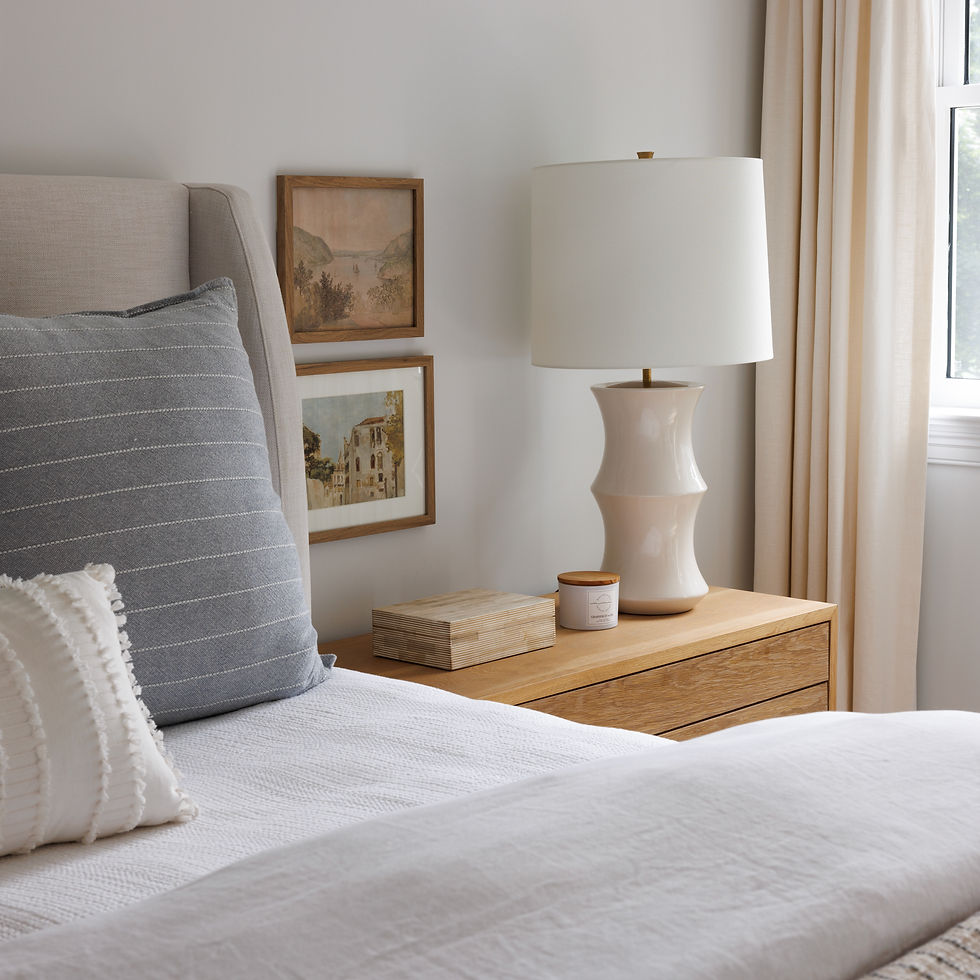
Between last week and this week's blog post, which room is your favorite? Stay tuned next month for the bedrooms, bathrooms, the guest house, and so much more!


.png)
Comments