Vista Del Campo Reveal Part 01
- Aug 15, 2023
- 6 min read

Now that we've received the final photos from our gals at Public 311, we're so excited to share this gorgeous, colorful home with you! The clients were adamant that they incorporate color into the entire house, and because of its scale, it was a tough challenge to pull off, but we are so pleased with how it all came together in the end. Scroll through today to see how we reconfigured a few walls and designed the entry, living room, pantry, and kitchen of this home on the coast!


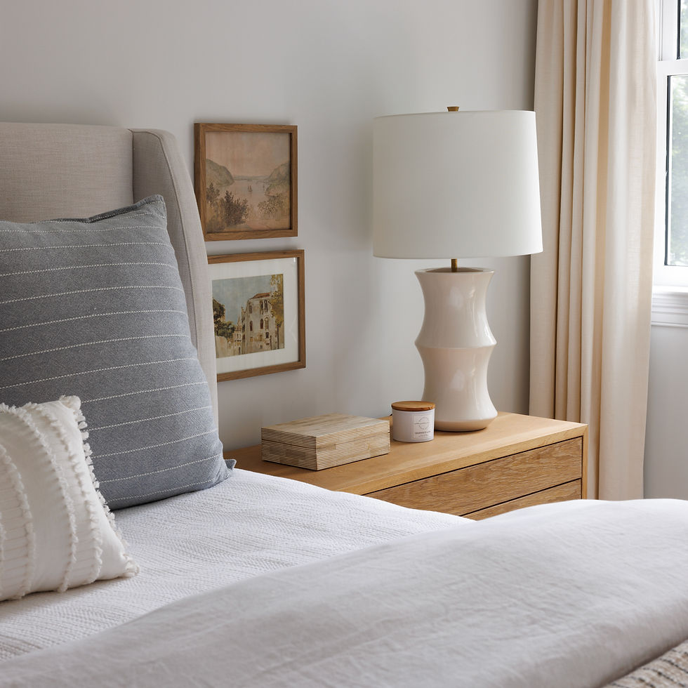
This entry photo highlights the original travertine floors that encompass most of the house, and the cost to replace it was not conducive to all of the other features they wanted to incorporate. Plus they have five kids that run and bike through the house, so these floors have already proven that they can definitely take a beating!

We started with an archway in the space, and you'll see that the original architect was a little soffit happy, and liked to add curves and niches in different places throughout the house. Typically, we try to eliminate a few to streamline, but we didn't want to drive up the budget, so we chose certain things that would make the most impact without being overwhelming to the budget to remove. For this niche, we widened it and found an incredible fiber artist to create a piece that matched the curve to make the entire wall look more intentional.
This console sets the tone for the other original built in elements that you'll see that have this Old World, weathered look, and the custom fiber artwork brings together all of our main colors for the shared spaces. I love that this photo really tells the story of the entire house in a way!

The entry opens up right to the formal living room to the left here, and you can see a bit of that deep blue pulling through in those chairs!

The soffit and curves in the living room next to the angled walls is a bit jarring visually, right?

The blue tiles emphasize the curves due to contrast, so we painted both the ceiling and all of the walls in a bright white to allow those architectural details to disappear visually, and used the same creamy tile from the kitchen backsplash to de-emphasize the fireplace!

With these fresh, new white walls, we used color in the furniture, rug, and textiles to bring it all to life! And with five kids, everything is upholstered in high performance fabrics with comfortable cushions, and they have plenty of seating for everyone to sit together, or for additional guests that come over.

I especially love the woven chairs because it's one of the first things that you see when you come into the house, and I always make a point to do something that has a little bit of detail that catches your eye if it's the first thing you're seeing upon entry.
We also added a brass light fixture to ground the room, where there was no fixture before. The space is just so massive that adding that light brings your eye back to the main part of the space!

I love these swivel chairs as well because they can turn back to the view and the fireplace when needed, and also give us that pop of deep color!

This is also our first sneak peek of these very intricate built-ins that the original owner of the home had shipped in from overseas. We decided to keep them from a budget perspective, but also loved the texture and richness they gave the house!

And now we move into the kitchen! We of course kept the carved opening that leads to the dining room and family room, but the layout of the walls changed a bit from where we started.
There was an opening right above the range that connects into the family room, and it seemed awkward and an unnecessary ledge for dust to collect. We closed that up to give the range wall a bit more presence, and create a blank slate backdrop for the family room media built ins we created on the other side of that wall (stay tuned for that later in the month!).
You'll also see the refrigerator built in to the angled wall to the right of the big entry to the other spaces. That felt like an awkward placement for such a large piece, so that area became the entry door to the pantry, where the refrigerator can hide away.

What a difference color can make!! The carved details really shine now because it's not just one of many dark toned wood elements in the room, and the light reflecting off the white walls just bring a brightness and lightness into the room that makes it a pleasure to be in now!

I know this can be a controversial take, but the clients were really adamant about not having upper cabinets in the kitchen. In their case, it worked from a storage perspective because they have plenty of lower cabinet space, and they wanted to eliminate one more step to open and close cabinet doors with the kids, who can actively help with preparing dinner and place settings!

Not having upper cabinets allowed us to make this gorgeous black and brass range the star of the kitchen, and do open shelves on either side for dishes and decorative items.
These sage green cabinets meant that we went with a quieter tile for the backsplash, but the soft pattern gives us just enough going on behind the range and the open shelves to take your eye around the room.
We used rift sawn white oak for the island and quartz countertops throughout the house as well.

Building the walls around the range allowed us to build in these spice niches on both sides, and therefore eliminate another nuisance when they're cooking! They are very organized as a family already, and the kids are so well-behaved that I don't doubt they will keep this space looking and feeling good!

These are the original sliding doors into the pantry, and as I said before, we moved the entry to where the refrigerator was along the angled wall, and that allowed us to have a big blank wall here instead...

...which meant we had the space to do a fantastic gallery wall of landscape art that incorporated all of the colors they love!

I'm very jealous of all the counter space they have, and of that view when they're washing dishes! I love the woven pendants above the sink as well - I will always love texture in lighting!

The angles of this counter, as well as the three niches, were really unnecessary, and visually cluttered the space for no good reason, so off we went with streamlining this for how they live in this house.

We installed two more white oak shelves to continue those from the range wall, and added a bit of artwork, vessels, a platter, and some food jars to complete the look!
We also incorporated a small drink fridge under the counter at the kids' level, so they could access their own drinks and snacks without having to ask mom or dad.

They also have a full size refrigerator as you've already seen, but they also have a full size freezer in the pantry that we had to find room to incorporate into the new pantry layout.

In the new pantry, we built flush oak cubbies with handles incorporated in for little hands to use and find snacks and other ingredients during the cooking process. We also brought the green into the pantry this adorable wallpaper, and used open shelves again for easy access to all of the plates, bowls, and platters needed.

The refrigerator and freezer were placed next to each other on the right side of the pantry, and they have their microwave oven under the counter as well. It was so nice to be able to hide all of the big appliances in this space and let the open layout in the kitchen shine!
There is SO much more where this came from - stay tuned throughout the next few weeks to see the 10+ spaces we have yet to show you in this house! Yep, you read that right - it's a big one, folks!


.png)
Comments