Oxnard Renovations
- Jun 16, 2020
- 5 min read

Well… I did it! I finally jumped on the blogger bandwagon and I am currently writing my very first post! I fought the idea for so long, mainly because I have never really enjoyed writing, but also because I didn’t think anyone would enjoy reading. I guess that is just my insecurity surfacing… so here I am trying my best to suck it up and get over it! If nothing else this will be a good way to document my work and visually see the ways that I’m making the world (or at least my little corner of the world) a prettier place.
I’m starting off with some before + after photos of a home we renovated in Oxnard this past year. The budget was super small and the timeline was super short, neither of which are ideal scenarios for a home renovation, but I think that is what makes these changes even more remarkable!
The home was built in the 80s, and although it is still a quaint little neighborhood, the home was definitely starting to show its age. We started by updating the exterior, opting to paint the house in Benjamin Moore’s Hale Navy and the trim in a crisp, contrasting white which keeps the exterior from feeling too dark and heavy.


We replaced the wood shingles, which were warped, lifting, and much darker from 30ish years of wear and tear. We opted to keep the warmth of the cedar, and sealed them up with a clear flat finish to keep them from being damaged by the sun. We added matching stained wood trim around the new garage door and entry door, and built the flower boxes out of the same wood to add warmth and character to the front windows. There was a lot of debate to keep the lighthouse address numbers, (ok not really) but we decided to go with some modern bronze numbers mounted on matching cedar plank. Much better!

The original front door was dark wood and had a janky, beat up screen door. The door wasn’t in horrible shape, so we decided to keep it and give it a quick facelift with a few coats of paint and some bronze hardware. The screen door got the boot, of course! We left the ceiling in this entry space white so it didn’t feel like you were entering the home through a cave!

The home has high, sloped ceiling in the entry and main living space, which definitely made the house feel spacious, but it was covered in popcorn that felt dingy and really dated the interior. There was a short pony wall that separated the entry from the living room, which really divided the space. Once we removed that and put the same wood flooring throughout the entire home, everything felt much more cohesive


The fireplace was painted in Swiss Coffee to match the walls, and topped with a reclaimed beam from Ross Alan Reclaimed Lumber.

Quick question… who needs a ceiling fan in the entry way? Answer? Nobody! Replace it with a pretty lantern and you’ll live a happier life, I promise! You’ll notice here that before the renovation there was an opening from the entry way into one of the bedrooms. It felt awkward, so we moved it to the hallway and were able to add a console with a cool clock above… a much better focal point than what was there before.


There is a space just off the living room that was primarily neglected prior to the renovation (except for one creepy recliner). We knew right away that we needed to capitalize on the wonderful natural light and turn it into a reading area + workspace. We replaced the old sliding glass door with some French doors, and hung a cool lantern instead of the dated track lighting + ceiling fan.


That super cool wall hanging was made by yours truly, from this tutorial. I typically don’t have a lot of extra time on my hands, but this was one of the projects I completed after my back surgery, so it has a special place in my heart!
The kitchen was a labor of love, and where the largest part of the budget was used. Prior to the renovation, the ceiling was dropped down about 12″ with fluorescent lights, the cabinets were old and starting to fall apart, and that countertop… don’t even get me started!


I originally wanted to remove the existing bay window, but decided we could save money by cleaning it up and turning it into an herb garden. I’m so glad we did because it adds so much character!


The blue tile backsplash makes such an impact. It’s the perfect touch of color without feeling too overwhelming, and I love that it has some distressing. I can’t get over how bad some of these before photos are! Sorry to the single dude that occupied the home prior to the renovation if you happen to read this! The farmhouse table, natural fiber rug, and some greenery really helped breathe light into this space. Plus, a cool linear lantern in place of (yet another) ceiling fan made all the difference!


Now on to one of my favorite transformations… the fish bathroom! There were several heated discussions about who got to keep the blue, fishy toilet seat, but I did the world a favor and made sure it got in the dumpster before it was hauled away. I can only hope that it stayed there! Haha!


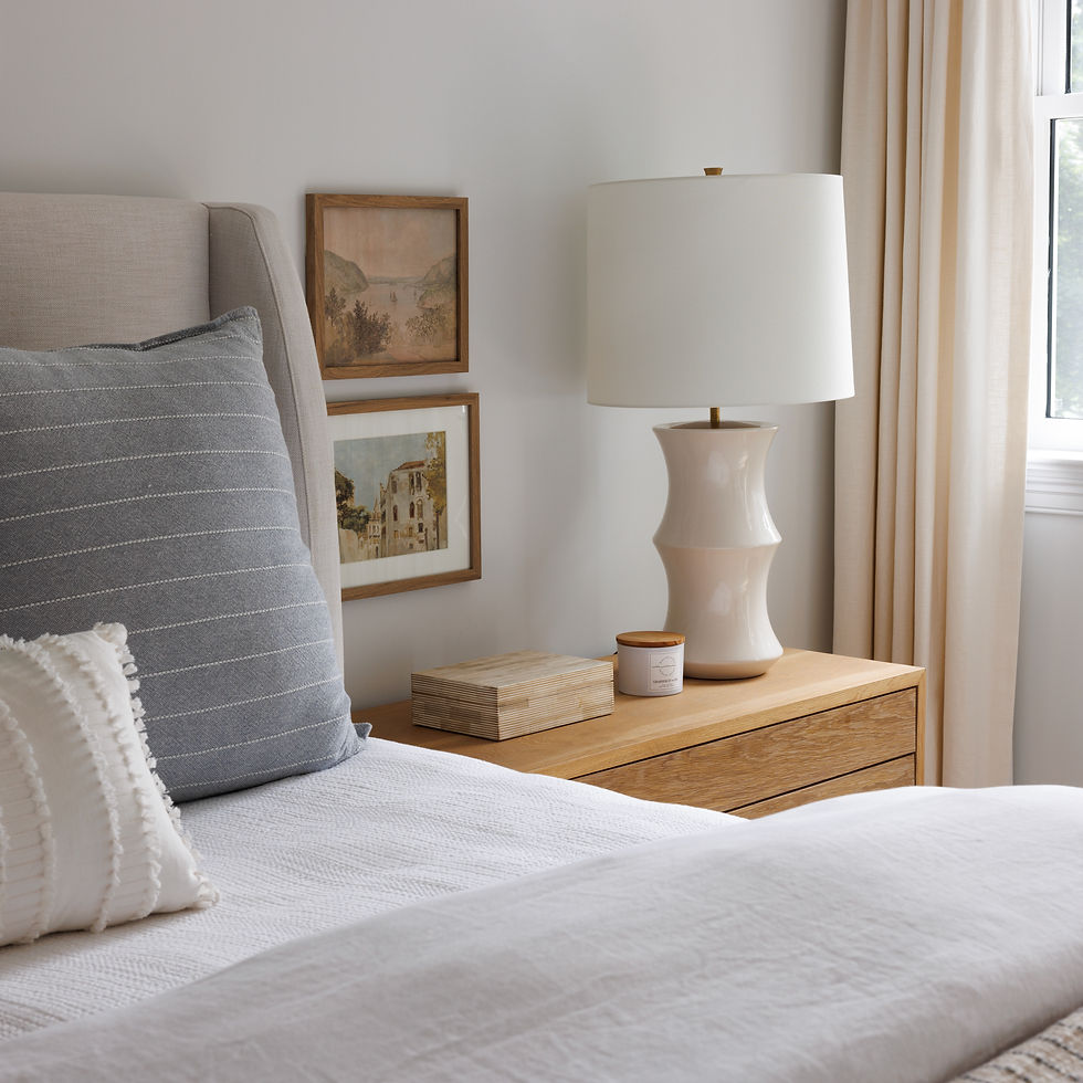
I’m not sure there are words for the Master Bedroom… underwhelming, maybe?


I love all the texture we included on the bed, from the carved wood headboard, to the fringed euro pillows, to the African mud cloth lumbar! Makes me want to get in bed now!

We accessorized with a lot of natural elements, including wood rounds, rice paper artwork, and carved vases.

There was no door to the bathroom area, and there was another short pony wall taking up half the space that could have been two sinks. We added a sink, framed the wall to add a barn door, and the space works so much better.


We added wood shelves and some plants to the existing bay window, and it makes this Master Bath seem so much more special than what it was before!

The front bedroom, which was previously accessed from the entry way, got a quick face lift too. New flooring, paint, and some fun furniture was all that was needed to take this space up a level.


The accessories, especially the pillows, made this room feel so cozy!

And, last but not least, the third bedroom! Goodbye wall mounted TV! Goodbye ugly carpet! Goodbye dark, drab walls! Helloooo warm, inviting, light-filled space!


So which room transformation was your favorite? Isn’t it amazing just how much this home changed in a matter of a few short months? Thank you for reading through all of this (if you got this far!!) and make sure you follow me on Instagram for more frequent updates
Until next time! Madison
PS: A very big thank you to Katherine Schwingel who took all the lovely “after” photos!


.png)
Comments