Paint Color Favorites of MND
- Apr 4, 2023
- 3 min read

Have you ever wondered what paint colors we come back to over and over again? Today is the day you find out - we have compiled our most used paint colors, and collected some new favorites in current projects, to share with you!
One big caveat we have to mention is that paint colors read VERY differently in different lighting. Where you live in the world will mean a different lighting scenario, as well as what direction your natural light sources face in a space. North facing windows will mean much less light throughout the day, versus west facing windows that bring sunlight in full force in the afternoon. Always swatch paint colors and observe them at different times of day to really determine if you like them.
Our favorite paint colors come from Benjamin Moore, unless noted otherwise!

Simply White is our go-to white color. It has neutral undertones, which means it's not too warm or too cool.
Swiss Coffee is a warmer toned white, if you're for an overall softer white look.
Chantilly Lace is a cooler toned white that reads very bright and crisp.


Pleasant Valley is a lighter, pale green blue that can brighten up a space with a touch of color.
Adirondack Green is definitely a more saturated tone than we typically go for, but it gives a fun pop and is great when used carefully!
Other greens that we are currently getting ready to use or having samples made are Dark Olive, Saybrook Sage, and Fatigue Green.


Gibraltar Cliffs is a blue gray with green undertones, and we used this in our office bathroom. It's a beautifully rich color in person that isn't overwhelming.
Nagaransett Green is labeled a green, but it does read more like a blue, possibly a deep teal that leans toward blue.
Hale Navy is a deep navy blue that looks great for an interior, also packs a punch when used for an exterior color.
Farrow & Ball's Hague Blue is a deep blue with some green undertones that I have never not loved. It's bold and beautiful!
Other blues that we’ve used previously but are waiting on photos for are Providence Blue, Santorini Blue (coming to a Laundry Room soon!), Water’s Edge, and Boothbay Gray.


Revere Pewter is a beautiful taupe color that can read more gray in some rooms and more of a tan undertone in others.
Stone Hearth is a bit deeper of a taupe, but has a more dramatic punch to it.
Balboa Mist is a very soft pale gray that still falls on the warmer spectrum.
Other colors that we are currently using on projects but don’t have photos of are Pashmina, Edgecomb Gray, Natural Cream, Balboa Mist, and Jockey Hollow Gray.


Like whites, you would be shocked by how differently blacks can read in different lighting! Here are some of our favorites, although we don’t typically have clients who want to use them on built-ins or in a full room. We want to though, so reach out if you’re brave enough!

And the color we are most excited to see in a project soon? Farrow and Ball Dead Salmon.
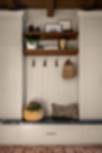
Might not sound that appealing, but don’t judge it by the name! We’re using it on kitchen cabinetry for an amazing client who is being so trusting of us! We’re pairing it with a stunning Calcutta Vagli marble, unlacquered brass cabinetry, and walnut accents. Drool!
This color is used in the above photo, although it definitely reads a bit more mauve-toned than it does in our client’s space. Another reminder to swatch your paint colors in your own space to see how it reads!
What are your favorite paint colors? Are any of them on our list? If you have a space painted in these colors, we'd love to see - tag us on Instagram to share!
.png)